Data Presentation Learnings with Edward Tufte

I had the opportunity recenlty to attend a lecture by Edward Tufte in San Francisco.
I entered not knowing what to expect, and I suppose my expectation was that I would be taught a set of practical tactics I could use in my day to day work. I was wrong.
But I was not disappointed. The lecture was well orchestrated and polished and was a blend of art, history, anecdotes, and tactics. Ultimately I found three things most valuable:
- Discussion of first principles
- Being immersed in various facets of data presentation
- Seeing such a large variation of illustrations that is mostly removed from what we see in daily business charts and slide decks
If you are looking for a course to pick up skills and techniques you can "copy and paste" to level up your presentation, this probably isn't the course for you. But if you are interested in some inspiration so you can become more effective through your own creativity, you may like the talk.
With that, here are some takeaways that I found most interesting:
Content is king and content is beautiful
Data presentation should be all about the content. The chrome should be eliminated. Everything in a presentation should better illustrate the content. A line separating things should have meaning about the content. An arrow between items should imply a verb... or even have an explicit annotation giving the arrow meaning.
Data presentation requires empathy
Can you step back, stand in the viewers shoes, and draw the intended conclusion from the evidence provided.
Get out of your own voice
When presenting (in person on on paper), get out of your voice frequently, switch to speaking from the voice of a customer, expert, etc… can use quotes, stories, anecdotes, etc
Particular, general, particular
Presenting tactic for explaining a diagram: pick a particular datapoint and describe it, then describe the general, then pick another particular datapoint and describe it... eg. “this number shows our conversion rate this week, the overall chart is organized to show conversion rate by segment, see here is another example of a segment with an interesting low conversion”
Problem, Importance, Solution... then present
Presenting tactic: summarize the problem, describe why it's an important problem, then explain the solution briefly at the start... then start the full presentation
Data experiments start with the model
When experimenting start with a model that you will use to calculate a result that answers the question... then collect data and plug it into the model. It keeps you honest rather than exploring data collected and cherry picking
“Better to be approximately right than precisely wrong”
Nice quote.
“Approach new information with an open mind, but not an empty head”
Another nice quote. He stressed not only the responsibility of the presenter, but also the responsibility of the viewer.
Do not segregate content by mode of production
When building data visualizations, DO NOT segregate content by mode of production. Text, images, graphs, etc can and should all be interleaved in beautiful ways if the visual tells the story… think DaVinci or Galileo notebooks or this figurative map of Napoleons march into Russia:
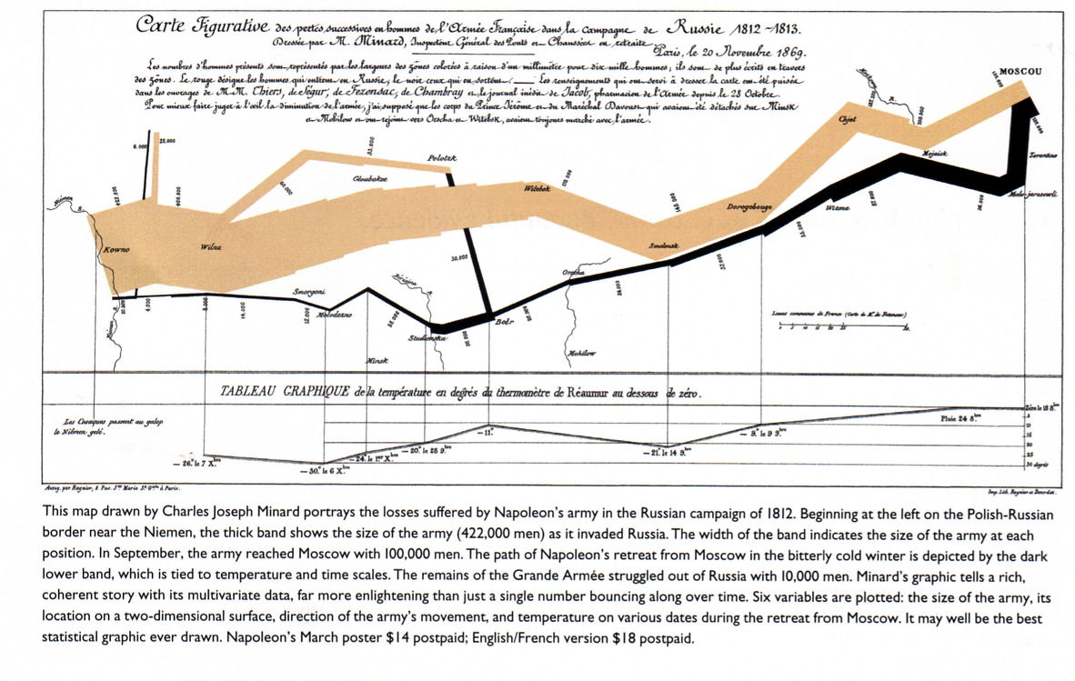
Tufte liked this visualization a lot and explained "everything on this visualization is about the soldier... the temperature, location, deaths, etc is all information about what happened to the soldiers." An interesting aside is that this was an anti-war illustration and the designer used the simple facts to illustrate the point.
I liked this image as well and I bought a poster of it that he was selling.
Macro-micro
Users are good at macro-micro analysis... a data visual taken in whole should paint broad strokes to give viewers contex... users can then decide what to drill into and explore more
Distribution in space is better than distribution in time
Prefer using space rather than time to present related data... Yes to one big (well illustrated) graphic, No to powerpoint deck. Let users see the big picture in one space that they can explore at their pace rather than making them wait for you to feed them information tiny bit by tiny bit over time.